QUESTION

CSAT

Easy

Maths

Prelims 2015

The graph depicts the earnings of A and B over the period 2000 to 2010:

52

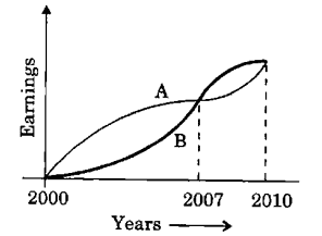
From the graph, which one of the following can be concluded?

Select an option to attempt

Explanation

Based on the chart:

  • Between the years 2000 and 2007, A's earnings were consistently higher than B's for all 7 years.
  • However, from 2007 to 2010, B's earnings exceeded A's for 3 consecutive years.
  • Despite this, A's average earnings over the entire period were still higher than B's average earnings.

Therefore, A had a higher average income compared to B during the given timeframe.

Trusted by 2L aspirants

Practice UPSC Prelims PYQs Smarter

Practice Now
  • Track accuracy & weak areas
  • See past trends & repeated themes
Start Practicing Now

Crack UPSC with your
Personal AI Mentor

An AI-powered ecosystem to learn, practice, and evaluate with discipline

SuperKalam is your personal mentor for UPSC preparation, guiding you at every step of the exam journey.

Download the App

Get it on Google PlayDownload on the App Store
Follow us

ⓒ Snapstack Technologies Private Limited